


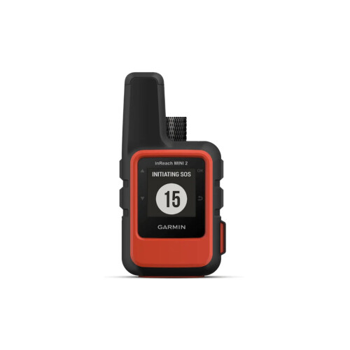
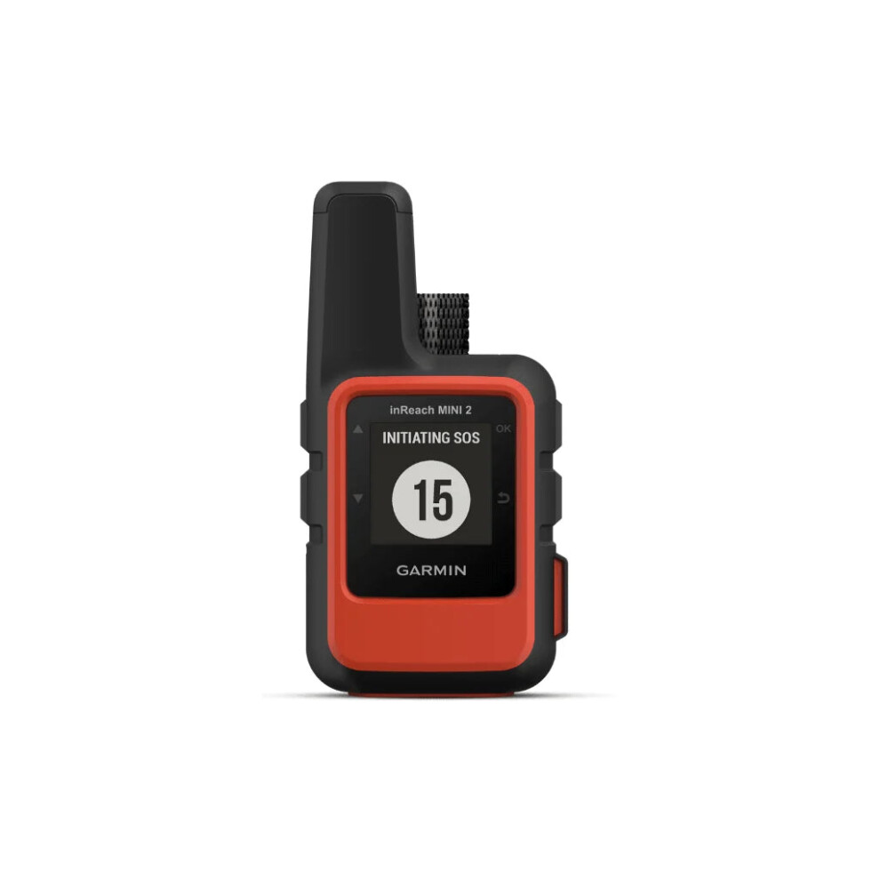


Garmin inReach Mini 2
In stock
Smart shoppers OnBuy it!
- Earn Cashback on every purchase – spend it instantly on your next order
- Free delivery – on millions of items across the site
- Customers love us – 139,000 Trustpilot reviews and an 'Excellent' rating
Interest-free payment options available


See full product description & details
Delivery: Standard (Free) | Thu 26th - Fri 27th Nov
Sold by: Global Telesat Communications
Returns: 30 days
180-day payment protection
You might also like


Summary
- Global satellite coverage keeps you connected when mobile phones can't.
- In an emergency, send an interactive SOS message to our coordination centre.
- You can still connect to the ones who matter, even without mobile phone coverage.
- With TracBack® routing, find your way back if you happen to get lost.
- Expand the capabilities of your inReach device by using the Garmin Explore™ app.
Garmin inReach Mini 2 Description
.gtc-mini2 { --blue: #003855; --blue-mid: #005c8f; --text: #3a5f73; --muted: #6b8493; --line: #dfeaf0; --soft: #f5f9fb; width: 100%; background: #ffffff; color: var(--blue); } .gtc-mini2 *, .gtc-mini2 *::before, .gtc-mini2 *::after { box-sizing: border-box; } .gtc-mini2 img { display: block; max-width: 100%; } .gtc-mini2-inner { width: min(1180px, calc(100% - 40px)); margin: 0 auto; } /* ========================================================= SIX-FEATURE BAR ========================================================= */ .gtc-mini2-feature-bar { background: #ffffff; border-top: 1px solid var(--line); border-bottom: 1px solid var(--line); } .gtc-mini2-feature-bar-grid { display: grid; grid-template-columns: repeat(6, 1fr); } .gtc-mini2-quick-feature { position: relative; padding: 25px 14px 23px; text-align: center; } .gtc-mini2-quick-feature:not(:last-child)::after { content: ""; position: absolute; top: 25px; right: 0; bottom: 25px; width: 1px; background: var(--line); } .gtc-mini2-quick-icon { height: 38px; margin: 0 auto 10px; display: flex; align-items: center; justify-content: center; } .gtc-mini2-quick-icon img { width: 34px; height: 34px; object-fit: contain; } .gtc-mini2-quick-feature h3 { margin: 0 0 5px; font-size: 13px; line-height: 1.22; font-weight: 700; color: var(--blue); } .gtc-mini2-quick-feature p { max-width: 145px; margin: 0 auto; font-size: 11px; line-height: 1.4; color: var(--text); } /* ========================================================= INTRO COPY ========================================================= */ .gtc-mini2-intro { padding: 55px 0 52px; background: #ffffff; } .gtc-mini2-intro-content { max-width: 940px; margin: 0 auto; text-align: center; } .gtc-mini2-eyebrow { margin: 0 0 11px; font-size: 12px; font-weight: 700; letter-spacing: 1.5px; text-transform: uppercase; color: var(--blue-mid); } .gtc-mini2-intro h2 { max-width: 800px; margin: 0 auto 18px; font-size: clamp(28px, 3.6vw, 42px); line-height: 1.12; font-weight: 700; color: var(--blue); } .gtc-mini2-intro-lead { max-width: 850px; margin: 0 auto 17px; font-size: 17px; line-height: 1.7; color: var(--text); } .gtc-mini2-intro-secondary { max-width: 820px; margin: 0 auto; font-size: 15px; line-height: 1.7; color: var(--text); } /* ========================================================= SIX FEATURE GRID ========================================================= */ .gtc-mini2-feature-section { padding: 20px 0 48px; background: #ffffff; } .gtc-mini2-feature-grid { display: grid; grid-template-columns: repeat(2, minmax(0, 1fr)); gap: 18px 28px; } .gtc-mini2-card { overflow: hidden; border-bottom: 1px solid var(--line); background: #ffffff; } .gtc-mini2-card-image { position: relative; overflow: hidden; aspect-ratio: 4 / 3; background: #ffffff; display: flex; align-items: center; justify-content: center; padding: 10px; } .gtc-mini2-card-image img { width: 100%; height: 100%; object-fit: contain; object-position: center; display: block; } .gtc-mini2-card-copy { padding: 12px 2px 20px; } .gtc-mini2-card-copy h3 { margin: 0 0 7px; font-size: 20px; line-height: 1.16; font-weight: 700; color: var(--blue); } .gtc-mini2-card-copy p { margin: 0 0 9px; font-size: 13px; line-height: 1.55; color: var(--text); } .gtc-mini2-card-copy ul { margin: 0; padding-left: 18px; } .gtc-mini2-card-copy li { margin: 3px 0; font-size: 12.5px; line-height: 1.45; color: var(--text); } .gtc-mini2-card-note { display: block; margin-top: 9px; font-size: 10.5px; line-height: 1.45; color: var(--muted); } /* ========================================================= BATTERY + RUGGEDNESS ========================================================= */ .gtc-mini2-bottom { padding: 12px 0 55px; } .gtc-mini2-bottom-grid { display: grid; grid-template-columns: 1fr 1fr; gap: 22px; } .gtc-mini2-info-panel { padding: 22px; background: var(--soft); border: 1px solid var(--line); border-radius: 8px; } .gtc-mini2-info-heading { margin-bottom: 15px; } .gtc-mini2-info-heading h3 { margin: 0 0 4px; font-size: 21px; line-height: 1.2; font-weight: 700; color: var(--blue); } .gtc-mini2-info-heading p { margin: 0; font-size: 12px; line-height: 1.45; color: var(--text); } /* BATTERY TABLE */ .gtc-mini2-table-wrap { overflow-x: auto; border: 1px solid #cfdee6; border-radius: 6px; background: #ffffff; } .gtc-mini2-table { width: 100%; min-width: 490px; border-collapse: collapse; } .gtc-mini2-table th { padding: 9px 10px; text-align: left; font-size: 11px; font-weight: 700; color: var(--blue); background: #dcebf3; } .gtc-mini2-table td { padding: 8px 10px; border-top: 1px solid #e0eaf0; font-size: 11px; line-height: 1.35; color: var(--text); } .gtc-mini2-table td:last-child { white-space: nowrap; font-weight: 700; color: var(--blue); } .gtc-mini2-table-note { margin: 9px 0 0; font-size: 10px; line-height: 1.45; color: var(--muted); } /* ========================================================= RUGGEDNESS ========================================================= */ .gtc-mini2-spec-grid { display: grid; grid-template-columns: repeat(4, 1fr); gap: 8px; } .gtc-mini2-spec { min-height: 128px; padding: 15px 8px 12px; text-align: center; background: #ffffff; border: 1px solid #d6e4eb; border-radius: 6px; } .gtc-mini2-spec-icon { width: 33px; height: 33px; margin: 0 auto 7px; display: flex; align-items: center; justify-content: center; color: var(--blue); } .gtc-mini2-spec-icon svg { width: 27px; height: 27px; } .gtc-mini2-spec strong { display: block; margin: 0 0 4px; font-size: 14px; color: var(--blue); } .gtc-mini2-spec span { display: block; font-size: 9.5px; line-height: 1.35; color: var(--text); } /* ========================================================= RESPONSIVE ========================================================= */ @media (max-width: 1000px) { .gtc-mini2-feature-bar-grid { grid-template-columns: repeat(3, 1fr); } .gtc-mini2-quick-feature:nth-child(3)::after, .gtc-mini2-quick-feature:nth-child(6)::after { display: none; } .gtc-mini2-quick-feature:nth-child(-n+3) { border-bottom: 1px solid var(--line); } .gtc-mini2-spec-grid { grid-template-columns: repeat(2, 1fr); } } @media (max-width: 780px) { .gtc-mini2-feature-grid, .gtc-mini2-bottom-grid { grid-template-columns: 1fr; } .gtc-mini2-card-image { aspect-ratio: 4 / 3; } } @media (max-width: 600px) { .gtc-mini2-inner { width: calc(100% - 28px); } .gtc-mini2-feature-bar-grid { grid-template-columns: repeat(2, 1fr); } .gtc-mini2-quick-feature:nth-child(3)::after { display: block; } .gtc-mini2-quick-feature:nth-child(2n)::after { display: none; } .gtc-mini2-quick-feature:nth-child(-n+4) { border-bottom: 1px solid var(--line); } .gtc-mini2-intro { padding: 42px 0 38px; } .gtc-mini2-intro h2 { font-size: 29px; } .gtc-mini2-intro-lead { font-size: 15px; } .gtc-mini2-intro-secondary { font-size: 14px; } .gtc-mini2-feature-grid { gap: 10px; } .gtc-mini2-card { padding-bottom: 8px; } .gtc-mini2-card-image { aspect-ratio: 1 / 1; padding: 6px; background: #ffffff; } .gtc-mini2-card-copy h3 { font-size: 19px; } .gtc-mini2-card-copy p, .gtc-mini2-card-copy li { font-size: 13px; } } /* ========================================================= IMPROVED MOBILE LAYOUT ========================================================= */ @media (max-width: 767px) { /* GENERAL PAGE WIDTH */ .gtc-mini2 { overflow-x: hidden; } .gtc-mini2-inner { width: calc(100% - 32px); max-width: none; margin-left: auto; margin-right: auto; } /* ======================================================= SIX FEATURE BAR 2 COLUMNS / 3 ROWS ======================================================= */ .gtc-mini2-feature-bar-grid { grid-template-columns: repeat(2, 1fr); } .gtc-mini2-quick-feature { min-height: 142px; padding: 20px 10px 18px; display: flex; flex-direction: column; align-items: center; justify-content: flex-start; } /* Reset desktop divider behaviour */ .gtc-mini2-quick-feature::after { display: none !important; } /* Vertical divider between the 2 columns */ .gtc-mini2-quick-feature:nth-child(odd) { border-right: 1px solid var(--line); } /* Horizontal dividers between rows */ .gtc-mini2-quick-feature:nth-child(-n+4) { border-bottom: 1px solid var(--line); } .gtc-mini2-quick-icon { width: 36px; height: 36px; margin-bottom: 9px; } .gtc-mini2-quick-icon img { width: 32px; height: 32px; } .gtc-mini2-quick-feature h3 { margin-bottom: 6px; font-size: 13px; line-height: 1.25; } .gtc-mini2-quick-feature p { max-width: 145px; font-size: 11px; line-height: 1.4; } /* ======================================================= INTRO Better reading layout on a phone ======================================================= */ .gtc-mini2-intro { padding: 38px 0 32px; } .gtc-mini2-intro-content { max-width: none; text-align: left; } .gtc-mini2-eyebrow { margin-bottom: 9px; font-size: 11px; line-height: 1.4; } .gtc-mini2-intro h2 { max-width: none; margin: 0 0 16px; font-size: 27px; line-height: 1.18; } .gtc-mini2-intro-lead { max-width: none; margin-bottom: 14px; font-size: 15px; line-height: 1.65; } .gtc-mini2-intro-secondary { max-width: none; font-size: 14px; line-height: 1.65; } /* ======================================================= FEATURE GRID ONE CLEAN CARD PER ROW ======================================================= */ .gtc-mini2-feature-section { padding: 4px 0 34px; } .gtc-mini2-feature-grid { grid-template-columns: 1fr; gap: 0; } .gtc-mini2-card { width: 100%; padding: 0; margin: 0 0 28px; border-bottom: 1px solid var(--line); } /* Let the square 1080x1080 source image dictate its own proportions instead of forcing it into another ratio. */ .gtc-mini2-card-image { width: 100%; height: auto; aspect-ratio: auto; padding: 0 12px; overflow: visible; background: #ffffff; } .gtc-mini2-card-image img { width: 100%; height: auto; max-height: none; object-fit: contain; object-position: center; margin: 0 auto !important; float: none !important; } .gtc-mini2-card-copy { padding: 12px 0 25px; } .gtc-mini2-card-copy h3 { margin: 0 0 9px; font-size: 20px; line-height: 1.25; } .gtc-mini2-card-copy p { margin: 0 0 11px; font-size: 14px; line-height: 1.6; } .gtc-mini2-card-copy ul { margin: 0; padding-left: 20px; } .gtc-mini2-card-copy li { margin: 4px 0; font-size: 13.5px; line-height: 1.5; } .gtc-mini2-card-note { margin-top: 10px; font-size: 11px; line-height: 1.5; } /* ======================================================= BATTERY + RUGGEDNESS STACK THEM ======================================================= */ .gtc-mini2-bottom { padding: 0 0 36px; } .gtc-mini2-bottom-grid { grid-template-columns: 1fr; gap: 16px; } .gtc-mini2-info-panel { width: 100%; padding: 18px 16px; border-radius: 7px; } .gtc-mini2-info-heading { margin-bottom: 14px; } .gtc-mini2-info-heading h3 { margin-bottom: 5px; font-size: 20px; line-height: 1.25; } .gtc-mini2-info-heading p { font-size: 13px; line-height: 1.5; } /* ======================================================= BATTERY TABLE FIT IT ON SCREEN - NO SIDEWAYS SCROLL ======================================================= */ .gtc-mini2-table-wrap { width: 100%; overflow: hidden; } .gtc-mini2-table { width: 100%; min-width: 0; table-layout: fixed; } .gtc-mini2-table th:first-child, .gtc-mini2-table td:first-child { width: 68%; } .gtc-mini2-table th:last-child, .gtc-mini2-table td:last-child { width: 32%; } .gtc-mini2-table th { padding: 9px 8px; font-size: 11px; line-height: 1.3; } .gtc-mini2-table td { padding: 9px 8px; font-size: 11px; line-height: 1.4; vertical-align: top; } .gtc-mini2-table td:last-child { white-space: normal; } .gtc-mini2-table-note { margin-top: 9px; font-size: 10.5px; line-height: 1.5; } /* ======================================================= RUGGEDNESS 2 x 2 GRID ======================================================= */ .gtc-mini2-spec-grid { grid-template-columns: repeat(2, minmax(0, 1fr)); gap: 8px; } .gtc-mini2-spec { min-height: 125px; padding: 15px 10px 13px; } .gtc-mini2-spec-icon { width: 32px; height: 32px; margin-bottom: 7px; } .gtc-mini2-spec strong { margin-bottom: 5px; font-size: 14px; } .gtc-mini2-spec span { font-size: 10.5px; line-height: 1.4; } } /* ========================================================= EXTRA SMALL PHONES ========================================================= */ @media (max-width: 400px) { .gtc-mini2-inner { width: calc(100% - 26px); } .gtc-mini2-quick-feature { min-height: 138px; padding-left: 7px; padding-right: 7px; } .gtc-mini2-quick-feature h3 { font-size: 12px; } .gtc-mini2-quick-feature p { font-size: 10.5px; } .gtc-mini2-intro h2 { font-size: 24px; } .gtc-mini2-card-image { padding-left: 5px; padding-right: 5px; } .gtc-mini2-card-copy h3 { font-size: 19px; } .gtc-mini2-info-panel { padding: 16px 13px; } }
messaging
Send and receive messages beyond mobile coverage.
Emergency support with two-way communication.
location sharing
Let others follow your journey remotely.
Retrace your route towards your starting point.
Request weather information while off-grid.
battery life
Extended runtime for longer trips away.
Communication beyond mobile coverage
Home is closer than you think.The Garmin inReach Mini 2 is a compact satellite communicator designed for people who travel, work and explore beyond reliable mobile coverage. Using the Iridium satellite network, it provides two-way messaging, location sharing, interactive SOS and weather information from remote locations where an ordinary mobile phone may no longer be able to connect.
Weighing just 100g, it is small enough to clip to a backpack, carry in a pocket or keep close at hand throughout your journey. Alongside its communication features, TracBack routing and a built-in digital compass provide useful navigation tools, while compatibility with Garmin's wider ecosystem gives you even more ways to plan, communicate and keep others informed while you're away.
When your phone loses signal, the inReach Mini 2 provides another way to stay in contact. With an active inReach subscription, messages are transmitted through the global Iridium satellite network rather than relying on terrestrial mobile coverage.
- Send and receive satellite text messages
- Global Iridium satellite connectivity
- Ideal for remote travel, expeditions and off-grid work
If an emergency occurs, the Mini 2 can send an interactive SOS to Garmin Response, Garmin's professionally staffed emergency response coordination centre. Because communication is two-way, important information can continue to be exchanged while assistance is being coordinated.
- Dedicated interactive SOS functionality
- Two-way communication during an emergency
- 24/7 emergency response coordination
MapShare gives friends, family members or colleagues a way to follow your progress remotely. Share your journey before setting off and provide people back home with greater visibility of where you are while travelling away from normal mobile coverage.
- Share your location with selected contacts
- Allow others to follow your progress remotely
- Useful for solo travel and longer expeditions
Plans change, trails become difficult to follow and visibility can deteriorate quickly. TracBack routing can guide you back along your recorded route towards where you started, while the built-in digital compass provides heading information even when you're standing still.
- Retrace your recorded journey
- Built-in digital compass
- Additional navigation support for remote environments
Conditions can change quickly when you're hiking, camping, sailing or working remotely. With an active inReach subscription, weather information can be requested for your current position or another location on your journey.
- Access weather information through inReach
- Check conditions beyond conventional mobile networks
- Useful for making informed decisions while travelling
Satellite communication requires an active Garmin inReach subscription, but there isn't a one-size-fits-all plan. Choose an airtime package based on how regularly you'll use the Mini 2 and how much messaging, tracking and weather data you expect to need.
- Plans available for lighter and more frequent users
- SOS capability included with active inReach service
- Choose a package to suit your expected usage
Battery performance changes depending on your tracking and activity recording settings.
*Garmin battery estimates shown with a full view of the sky. Actual battery life varies according to settings, usage, satellite visibility and environmental conditions.
Small enough to carry anywhere, with the durability needed for outdoor use.
Details
| OPC | P8V68VG |
|---|---|
| Brand | |
| Codes | 0665878763046 (EAN) |
| 665878763046 (UPC) | |
| Links | Garmin Gps |

Product Images

Detailed Product Information
| Colour | Black |
|---|---|
| Weight | 100g |
| Height | 4in |
| Length | 2in |
| Width | 1in |
| Colour | Black |
| Weight | 100g |
| Height | 4in |
| Length | 2in |
| Width | 1in |
Customers also buy
Compare Sellers for Garmin inReach Mini 2
- New from £250.83
| Seller | Ratings | Warranty | Returns | Price | Delivery | Total | Quantity |
|---|---|---|---|---|---|---|---|
| (7 reviews) | 24 months |
30 Days
Free Returns Yes
|
£250.83
|
+Fast & Free Delivery
Est. Delivery:
26th-27th Nov
|
£250.83
|
Earn as you shop with instant Cashback on everything.
No catch, no cost
- Paid into your OnBuy account
- Spend it on your next purchase
- Save it or withdraw it
Become a Cashback VIP
Just 1 purchase unlocks bigger deals & rates